Challenges
- Multi-Click Process To Access Information
- Bloated WordPress Theme Slowing Down Site
- Non-intuitive Scrolling Behavior
- Visual Design Refresh Needed
Goals
- Achieve Design Similar To Rolex
- Showcase Company Achievements
- Information Should Be Easily & Quickly Accessible (2-Click)
Highlights
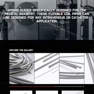
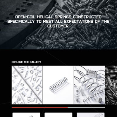
- Beautiful Image Gallery UX
- Professional Video Of Operations
- Custom WordPress Admin Areas
- Better UX across all devices
Overview
Cook Spring Company is a reputable, versatile, and innovative manufacturer of precision springs and wire forms. Located in our backyard of Sarasota, FL, Cook Spring is the leading medical coil manufacturer.
The previous website was built on the WordPress CMS and using a bloated theme. While this theme provided all the bells and whistles, Cook Spring was only using 5% of the theme’s capabilities. This resulted in a slower user experience and created some oddities in the mobile experiences.
Cook Spring Company has been in business since 1954 and was looking for a website that would really showcase their company achievements.
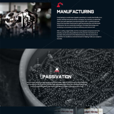
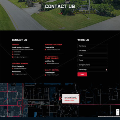
This project really popped with the inclusion of creative video, taking every user on a personal journey through the manufacturing process. The cinematics captured on this project make us smile every time. The Cook family requested that we base our design on the Rolex website.
We feel confident that we accomplished our goals. Cook Spring Company is overjoyed with their new site. We hope you experience why!
Challenge #1
User experience was difficult to navigate for the end-user.

Solution
We consolidated information and pages to create an experience that required no more than 2 clicks to access any information.
Challenge #2
Bloated WordPress Theme was slowing down site performance.

Solution
We designed and created a custom theme with theme options only pertaining to their site. The website loads quickly without all those “extra features.”
Challenge #3
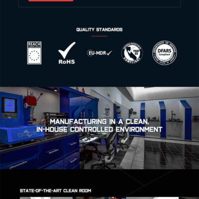
Visual Design Refresh was needed. The client really wanted to go with a design similar to Rolex.

Solution
We placed the website on a dedicated server with 3x the amount of resources needed with the ability to dynamically scale with traffic demand.
Challenge #4
The website was not easily customizable and created a lid for the client’s creative ideas.

Solution
We went through the design process, giving them a few different directions. The client went with a dark theme design that really made their products pop in the end.

