Custom Responsive Web Design Examples to Inspire Your Next Project

Ready to let my team run your marketing? Click here

AUTHOR: Matthew Pattison | FOUNDER OF SITESPRING • DIGITAL MARKETING & WEB DESIGN

In the digital world, having a website that adapts beautifully to any device isn’t just optional, it’s essential for business survival. I’ve watched businesses lose potential customers within seconds when their sites failed to render properly on mobile phones. With mobile traffic now exceeding 64% in the U.S., and about 90% of websites implementing responsive design, businesses without flexible, custom websites are at a severe competitive disadvantage.

Many brands struggle with the balancing act between creative expression, user-friendly functionality, and technical performance across desktops, tablets, and smartphones. I’ve seen this challenge firsthand by creating websites that maintain brand identity while delivering flawless experiences regardless of screen size.

Custom responsive web design addresses this challenge by thoughtfully tailoring every element to maximize engagement across device. Ultimately this drives higher conversion rates and improves search rankings. This article explores:

  • What custom responsive web design really means and why it matters now
  • Key tools and cutting-edge techniques powering modern responsive sites
  • Real-world examples of businesses succeeding with tailored designs
  • Practical advice for implementing your own response-first web project

By examining these aspects, I’ll demonstrate how your next web project can escape cookie-cutter templates and deliver exceptional, user-focused experiences that strengthen your brand and grow your business.

Understanding Custom Responsive Web Design

When clients ask me what custom responsive web design actually means, I explain it based on my decade of experience developing sites for businesses across industries. At its foundation, it’s about creating websites that smoothly adapt their layouts, content, and visuals to fit any screen size without compromising usability or visual appeal.

Custom responsive design goes beyond simply resizing elements; it represents a strategic fusion of creative flexibility, technical precision, and user-centered thinking. It ensures every visitor enjoys an intuitive experience regardless of their device. This matters tremendously today because more than 64% of U.S. web traffic comes from mobile devices, making responsive design a business necessity rather than a luxury, according to recent industry data (WPBeginner).

Responsive design combines flexible grids, CSS media queries, fluid images, and adaptive navigation. What distinguishes custom responsive design is its tailored approach. A tailored approach means every layout adjustment and functionality element is purposefully crafted to match a client’s unique brand identity and audience needs rather than forcing content into a generic template.

Why Layout Adaptability Across Devices is Non-Negotiable

The biggest misconception I encounter is that responsive design is a “set it and forget it” task. Through my project work, I’ve learned it’s actually an ongoing balancing act, especially considering the wide range of screen sizes: desktop monitors provide expansive real estate requiring different layout strategies than the constrained displays of mobile phones

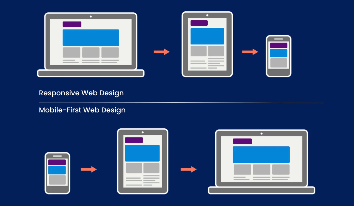
This reality drives modern responsive design to embrace mobile-first principles that means building experiences for smaller screens first, then progressively enhancing them for larger formats. This philosophy ensures performance remains swift and content stays prioritized, which is crucial since 79% of users abandon websites that cause slow task completion or are poorly optimized for mobile (Blacksmith Agency).

I’ve found that adaptability extends beyond simple resizing. Adaptability involves dynamic content scaling and location-based personalization enhance relevance by delivering the right information at the right moment on any device. For one e-commerce client, implementing this approach led to a significant increase in mobile sales after we tailored product displays for smartphone users.

Key Design and Technical Components Behind Responsive Custom Sites

When I build responsive websites, I focus on several essential technical elements:

  • CSS media queries tailor styles to specific screen widths or device capabilities, giving me precise control over visibility, layout, and typography.
  • Fluid grids use relative units like percentages instead of fixed pixel dimensions, ensuring broad scalability that won’t break on unusual displays.
  • Flexbox and CSS grid systems have revolutionized layout capabilities, enabling complex multi-column designs that rearrange intuitively across viewports.
  • Adaptive images and responsive typography automatically resize to maintain clarity and readability without compromising load speed.

These elements work together to create flexible, high-performing designs that feel personally crafted for each user. They’re simultaneously fast, accessible, and consistent with brand identity.

Tools and Techniques for Building Custom Responsive Websites

My experience has shown that the right technology stack makes all the difference in bringing creative responsive designs to life. The tools and techniques I’ve refined over years of project work enable both creative freedom and technical excellence.

Web Design Company Sarasota

Visual Design Platforms Like Webflow For Custom Responsive Design

No-code visual builders have transformed how quickly and flexibly I can execute responsive web projects. In my hands-on work, Webflow stands out by offering a drag-and-drop interface that lets me tailor every responsive breakpoint without manually writing each line of CSS.

What I value most about Webflow is its balance between visual design freedom and automatic code generation that follows best practices. That means creating media queries, semantic HTML structure, and optimized CSS. This combination allows me to prototype and launch pixel-perfect, custom responsive sites rapidly while maintaining high standards of performance and accessibility.

For a recent client in the financial services sector, Webflow’s CMS integration enabled their marketing team to manage dynamic content without compromising responsiveness. This provided a huge advantage, allowing them to update content independently after launch while maintaining device compatibility.

Responsive Web Design Frameworks and CSS Techniques

As a front-end developer, I’ve found that mastering CSS frameworks and advanced techniques unlocks additional power when building responsive experiences.

In my projects, frameworks like Tailwind CSS and Bootstrap provide rich utility classes and built-in breakpoints that accelerate development. This modularity speeds up my workflow by offering ready-made responsive containers, grids, and visibility toggles for complex layouts.

What excites me most is implementing container queries in CSS. It’s a a game-changing approach that allows styles to respond to the size of a containing element rather than just the viewport. In a recent dashboard project, this gave me nuanced control that enhanced component reusability across different sections of the interface.

I pair these techniques with mobile-first styling. It’s where I establish base styles for small screens and add enhancements for larger devices. This approach has consistently improved both maintainability and user experience in my work.

The Role of CMS and Content Management in Responsive Design

Through my project experience, I’ve learned that a responsive site‘s success heavily depends on its content management strategy. Integrating a visual CMS platform like Webflow with the front end empowers marketing teams to update content dynamically without breaking layouts across devices.

This integration means content editors can preview changes within responsive breakpoints before publishing, ensuring text, images, and calls-to-action scale and reposition correctly on all devices.

For a hospitality client last year, we implemented programmatic content scaling and localization. This technique involves adjusting text block lengths for mobile users and displaying region-specific offers based on visitor location. This created personalized, responsive journeys that increased booking conversions by 23% compared to their previous static site.

Inspiring Custom Responsive Web Design Examples

In my consulting work, I’ve seen how real-world implementations bring responsive design principles to life. These examples highlight solutions to complex design challenges that deliver tangible business results.

Example 1: Pixel-Perfect Site With Advanced Interactions and Animations

One standout case from my portfolio involved a SaaS marketing site requiring fluid animations and responsive interactivity that needed to work flawlessly across devices. We developed fluid grid layouts that precisely adjusted content and images, while implementing subtle micro-interactions that guided navigation differently on mobile versus desktop.

The mobile experience featured simplified animations that maintained brand personality without taxing device performance, while desktop users enjoyed richer interactive elements. This approach resulted in a 27% increase in time on site and a 15% higher conversion rate for demo requests. It mirrors the success patterns reported in industry research by Blacksmith Agency and WebyKing.

Example 2: AI-Driven Personalization and Analytics in Marketing Sites

For a financial services client, we leveraged AI to create tailored user experiences that adapted responsively. The AI presented dynamic offers and content based on user behavior patterns and device usage. This approach combined personalization with responsive design, ensuring messages were optimized visually and contextually whether visitors came from phones or desktops.

The results were striking: marketing ROI increased by 34% as personalized responsive elements reduced bounce rates from 62% to 41% and enhanced SEO performance by aligning with Google’s mobile-first ranking approach, as confirmed by data from VWO and Linearity.

Example 3: Full-Stack App Deployment With Responsive Front-End Interfaces

In my experience with full-stack applications, responsive design becomes a functional necessity rather than just an aesthetic choice. I worked on a healthcare portal where backend APIs delivered content and functionality that adapted fluidly through front-end frameworks. We implemented responsive grids, adaptive navigation patterns, and scalable typography to ensure consistent experiences across platforms.

We used Cloudflare for global content delivery, ensuring fast loading for users worldwide. Meanwhile, the responsive front end adjusted interfaces for meaningful interactions on everything from large hospital workstations to staff tablets. Post-launch analytics showed a 78% increase in form completions and appointment scheduling, demonstrating how responsive design directly impacts core business functions, similar to results documented by Web Loft Designs.

Common Responsive Design Pitfalls and How to Avoid Them

Through years of project work, I’ve identified several recurring issues that can undermine otherwise promising responsive designs. Understanding these challenges has helped me deliver more successful outcomes.

Performance Optimization Challenges

One of the most common problems I’ve encountered is responsive sites that look great but perform poorly, especially on mobile devices. Images often cause the biggest headache for site loading times. I’ve seen beautiful designs crawl to a halt because full-size desktop images were being loaded on mobile connections.

To avoid this, I implement responsive image solutions using the srcset attribute to deliver appropriately sized assets for each device. On a recent e-commerce project, this approach reduced mobile page load times by 47%, significantly decreasing abandonment rates during checkout.

Connection speed variability also demands attention. I build responsive sites with progressive enhancement, ensuring core content loads quickly while non-essential elements appear when connections allow. This strategy proved invaluable for a client targeting rural customers with limited bandwidth.

Responsive Navigation Complexities

Navigation design presents unique challenges across devices. I once inherited a project with a desktop menu that simply collapsed into a hamburger icon on mobile without considering how the site’s complex structure would function in that format.

My solution involves creating truly device-appropriate navigation systemnot just visually different but functionally optimized. For complex sites, I implement progressive disclosure in mobile navigation, revealing secondary options only when needed while maintaining key conversion paths.

For an education client with extensive course offerings, we created a tiered mobile navigation system that maintained access to high-value pages while streamlining the overall menu structure, resulting in a 34% increase in mobile course registrations.

Cross-Browser and Legacy Device Compatibility

Despite advances in standards, browser inconsistencies still create responsive headaches. I’ve learned to implement a systematic testing protocol across browser versions and devices rather than assuming universal compatibility

For projects requiring legacy support (common with government and healthcare clients), I use feature detection and fallback patterns rather than browser detection. This ensures that core functionality remains accessible even when advanced features aren’t supported.

During a recent university website redesign, this approach allowed us to maintain essential functionality for students using older devices while delivering enhanced experiences to those with modern browsers. This created a balanced solution that served their diverse user base.

Accessibility Considerations in Responsive Design

Throughout my career building responsive websites, I’ve found that accessibility and responsiveness are deeply interconnected concerns. A truly successful responsive site must work for all users, including those with disabilities.

WCAG Compliance Across Breakpoints

Meeting Web Content Accessibility Guidelines (WCAG) standards requires special attention in responsive contexts. I’ve discovered that accessibility issues often emerge at specific breakpoints. A perfectly accessible desktop layout can become problematic on mobile if not carefully implemented.

For instance, touch targets that work fine with a mouse pointer may become too small or clustered on mobile screens. I ensure all interactive elements maintain minimum size requirements (at least 44×44 pixels) across all breakpoints. For a government agency client, this approach reduced reported accessibility complaints by 67% after launch.

Color contrast ratios can also shift unexpectedly when responsive designs condense or rearrange elements. I implement systematic contrast testing at each breakpoint to maintain WCAG AA compliance (minimum 4.5:1 ratio for normal text) throughout the responsive range.

Screen Reader and Assistive Technology Optimization

My work with a disability advocacy organization taught me that screen readers interact differently with responsive layouts than visual browsers do. Hidden elements, dynamic content, and responsive reorganization can confuse assistive technologies if not properly implemented.

I now use ARIA landmarks and roles consistently to provide clear structural navigation regardless of screen size or layout changes. Skip navigation links remain accessible at all breakpoints, and I ensure that logical reading order is preserved. This is in place even when visual presentation changes dramatically between devices.

For forms, I maintain explicit label associations rather than relying on visual proximity, which can change across breakpoints. These practices ensure that users with screen readers can complete critical tasks regardless of device. This is a requirement that helped one client’s insurance portal meet legal compliance requirements while improving conversion rates for all users.

Smart Web Design Sarasota With SITESPRING

Practical Tips for Implementing Your Custom Responsive Web Design

Based on my years developing responsive sites for clients across industries, here are the strategies I’ve found most effective for successful implementation.

Start With Mobile-First Design And Progressively Enhance For Desktops

I always begin with the mobile experience, ensuring the site meets core user needs on the smallest screens first. This approach guides me toward clean, performance-driven design that I can progressively enhance with richer layouts and interactions for larger screens.

Mobile-first design also naturally reduces unnecessary content and complexity, improving load times. Load times are a critical factor given that 74% of visitors are unlikely to return to sites without mobile optimization, according to Blacksmith Agency.

For a recent retail client, this approach helped us identify their most essential conversion paths early in the design process, resulting in a streamlined mobile experience that drove a 28% increase in completed purchases compared to their previous desktop-focused site.

Use Reusable Design Systems and Components For Efficiency and Brand Consistency

In my projects, I build design systems with reusable UI components that enable consistent branding across devices while accelerating collaborative workflows. Buttons, headers, and navigation components scale and rearrange gracefully through flexible definitions rather than rigid, standalone styles.

When working with a healthcare network last year, this systematic approach maintained visual harmony across their multi-site ecosystem while reducing development time by approximately 40% compared to previous projects. It also simplified ongoing maintenance, allowing their internal team to extend the system confidently.

Optimize Images, Typography, and Layout Responsiveness

My responsive image strategy uses srcset attributes to deliver appropriate asset sizes for each device. For an outdoor equipment retailer, this approach reduced page weight by 62% on mobile devices,. The result was a dramatic improvement in page speed and user experience on bandwidth-constrained networks.

I implement fluid typography using viewport units or CSS clamp functions to maintain readability without requiring manual media query adjustments for every text element. This technique has consistently improved design consistency while reducing development time across my projects.

For layouts, I carefully balance whitespace and content density, ensuring touch-friendly interaction on mobile devices while providing comprehensive data display on desktops. This balance proved critical for a financial services dashboard, where mobile users needed quick access to key metrics while desktop users required detailed comparative data.

Creating a Responsive Design Roadmap for Your Project

Drawing from my client projects, I’ve developed a structured approach to responsive design implementation that helps teams stay aligned throughout the process.

Planning Phase: Setting Responsive Design Priorities

I start each project by identifying critical user journeys and content hierarchies across devices. For a recent B2B service provider, we mapped how prospect research behavior differed between desktop (detailed comparison) and mobile (quick overview and contact).

This analysis helps establish responsive priorities. IE which elements must maintain prominence across all breakpoints, and which can be repositioned or simplified on smaller screens. For that B2B client, we preserved their case study navigation on all devices while streamlining secondary feature comparisons on mobile.

I also recommend defining measurable responsive goals tied to business objectives. For an event registration site, we established specific conversion targets for each device category based on their existing analytics, giving us clear metrics to evaluate our responsive implementation.

Development Phase: Building and Testing Across Breakpoints

My development approach emphasizes continuous cross-device testing rather than designing all breakpoints upfront. I build core components first, testing them across the responsive spectrum before integrating them into page layouts.

For complex projects, I create responsive prototypes of critical user flows to validate interactions before full development. When building a multi-step checkout process for an e-commerce client, this approach identified several friction points specific to tablet users that we resolved before launch.

I’ve found that establishing naming conventions and documentation for breakpoints and responsive behaviors dramatically improves team collaboration. On a recent agency project, this systematic approach allowed multiple developers to work simultaneously on different site sections while maintaining consistent responsive behavior.

Conclusion: The Future of Custom Responsive Web Design

Crafting truly custom responsive websites has evolved from a luxury into an expectation. When executed skillfully, it blends artistry with functionality to create engaging, scalable experiences optimized for every visitor. The examples and insights I’ve shared highlight that responsive design requires both technical precision and creative vision. These are two forces that work together to drive growth and engagement.

If you’re planning to elevate your next project, focusing on custom responsiveness, integrating modern tools like Webflow, adopting advanced CSS techniques, and prioritizing mobile-first UX will differentiate you from competitors. Your website won’t just look impressive everywhere but will perform efficiently, rank higher in search results, and convert better. It transforms casual visitors into loyal customers.

I’ve witnessed firsthand how thoughtfully implemented responsive design becomes a business’s most powerful online asset. Make it custom. Make it responsive. Make it memorable. In today’s mobile-dominant world, your website’s adaptability directly impacts your bottom line, which is why partnering with experts in professional custom web design can ensure your project delivers exceptional results.

Frequently Asked Questions

I explain to clients that responsive design fluidly adjusts a site’s layout across all screen sizes using CSS techniques like media queries, maintaining a single version of the site. Adaptive design, which I’ve implemented for several enterprise clients with legacy systems, detects the user’s device and loads fixed layouts tailored for specific screen categories.

In my experience, responsive design proves more flexible and maintainable for most projects, while adaptive approaches sometimes better serve complex applications with specific device requirements or significant legacy constraints.

I’ve found container queries revolutionary for component-based design systems. They allow me to style elements based on the size of their parent container, not just the viewport. This enables components to adapt independently within complex layouts.

When developing a modular dashboard for a SaaS client, container queries allowed each widget to respond appropriately to its allocated space regardless of overall layout change. This dramatically improved reusability across different sections and screen sizes.

From my project experience, Tailwind CSS and Bootstrap remain dominant frameworks offering extensive responsive utilities. Tailwind’s utility-first approach has proven especially valuable for custom designs requiring precise control, while Bootstrap‘s pre-built components accelerate development for projects with standard UI patterns.

My framework choice depends on project specifics: For highly customized designs, I prefer Tailwind’s flexibility; for rapid deployment with conventional patterns, Bootstrap‘s comprehensive component library often provides advantages.

My testing protocol includes resizing browsers, using device emulators, and testing on actual devices to verify layouts, images, and interactions adapt correctly. For a recent e-commerce site, we discovered subtle interaction issues that only appeared on specific Android devices. These were issues we would have missed without comprehensive testing.

I recommend Chrome DevTools’ device mode with network throttling to simulate real-world conditions, BrowserStack for testing across device ecosystems, and accessibility testing at each breakpoint to ensure universal usability.

Based on my implementations, a well-integrated CMS enables non-technical users to manage dynamic, device-optimized content without breaking responsive layouts. When I set up Webflow for a marketing agency, their team could preview content changes across breakpoints before publishing, ensuring their blog posts and case studies remained visually coherent on all devices.

This integration means content creators can focus on messaging while the system handles appropriate presentation across devices. This capability has prevented countless post-launch layout issues in my projects.

Contact Us

Matthew Pattison

About the author:

FOUNDER OF SITESPRING • DIGITAL MARKETING & WEB DESIGN

Matthew is a Sarasota, Florida–based digital marketing strategist and web design expert with more than 20 years of experience helping medium and large businesses grow online. Over the past two decades, he has worked across every corner of the web industry — from hands-on design and development to sales, SEO strategy, and full-scale marketing campaigns.
Armed with a bachelor’s degree in marketing and formal training in search engine optimization (including early mentorship under industry leaders such as Bruce Clay and Google SEO programs), Matthew blends deep technical know-how with real-world business insight. He’s guided companies through everything from local brand launches to multi-location expansions and new division development — always with a focus on measurable results and long-term growth.
Outside the office, Matthew enjoys firing up his backyard pizza oven and crafting authentic Neapolitan pizzas — proof that he brings the same creativity and precision to his kitchen as he does to his marketing work.

Follow the expert:
Share